01
What's inside the pack
One download, four folders. Every part is built the same way we build for clients — flat, legible, and easy to restyle to your art direction.
Components
120+ interface parts
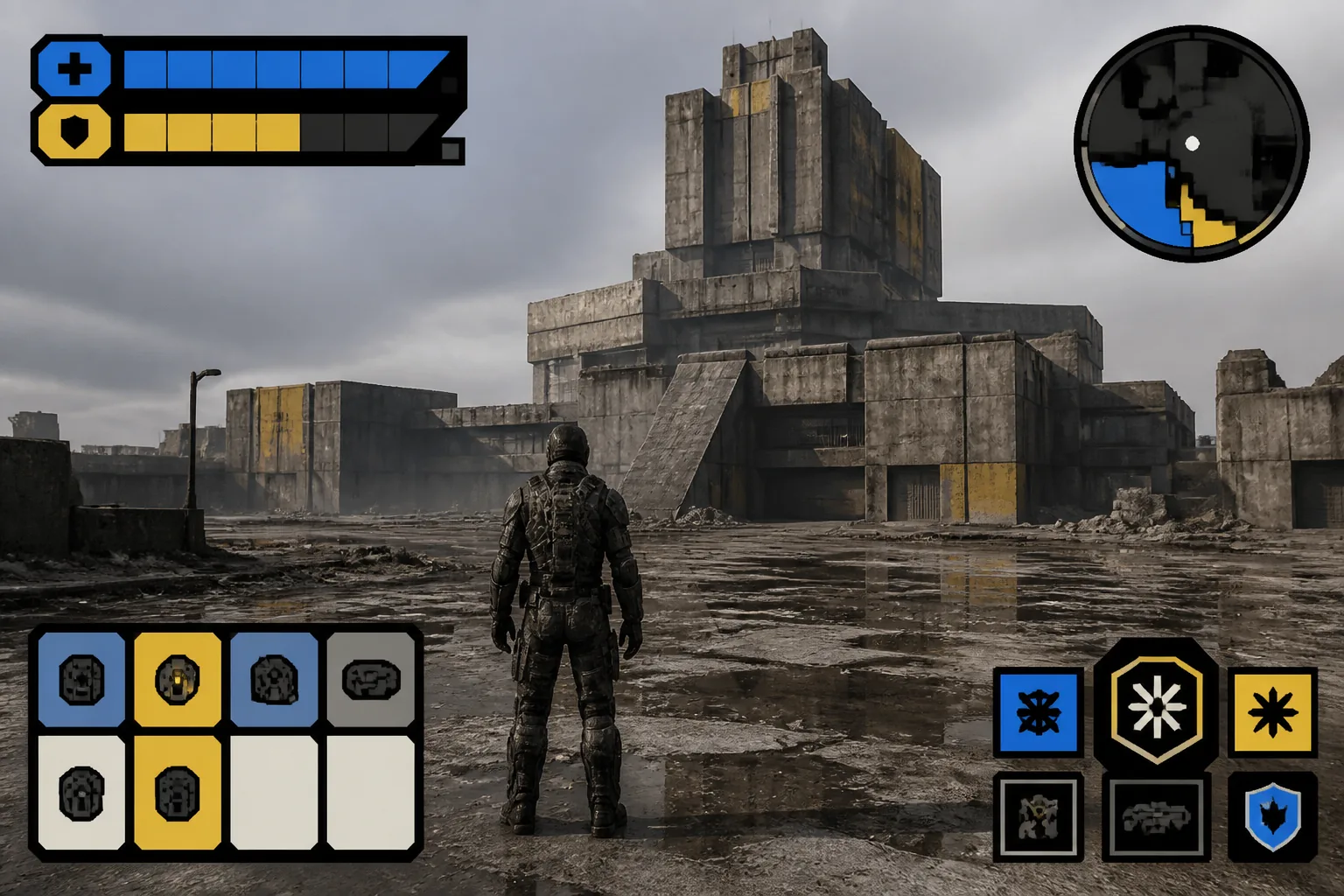
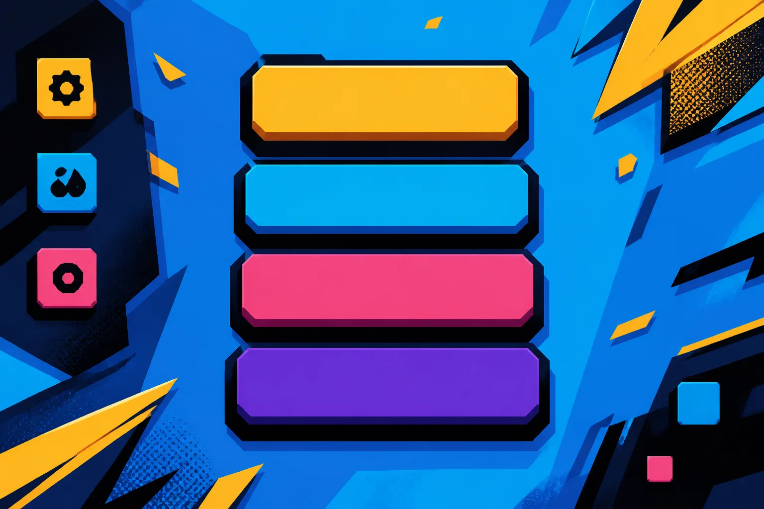
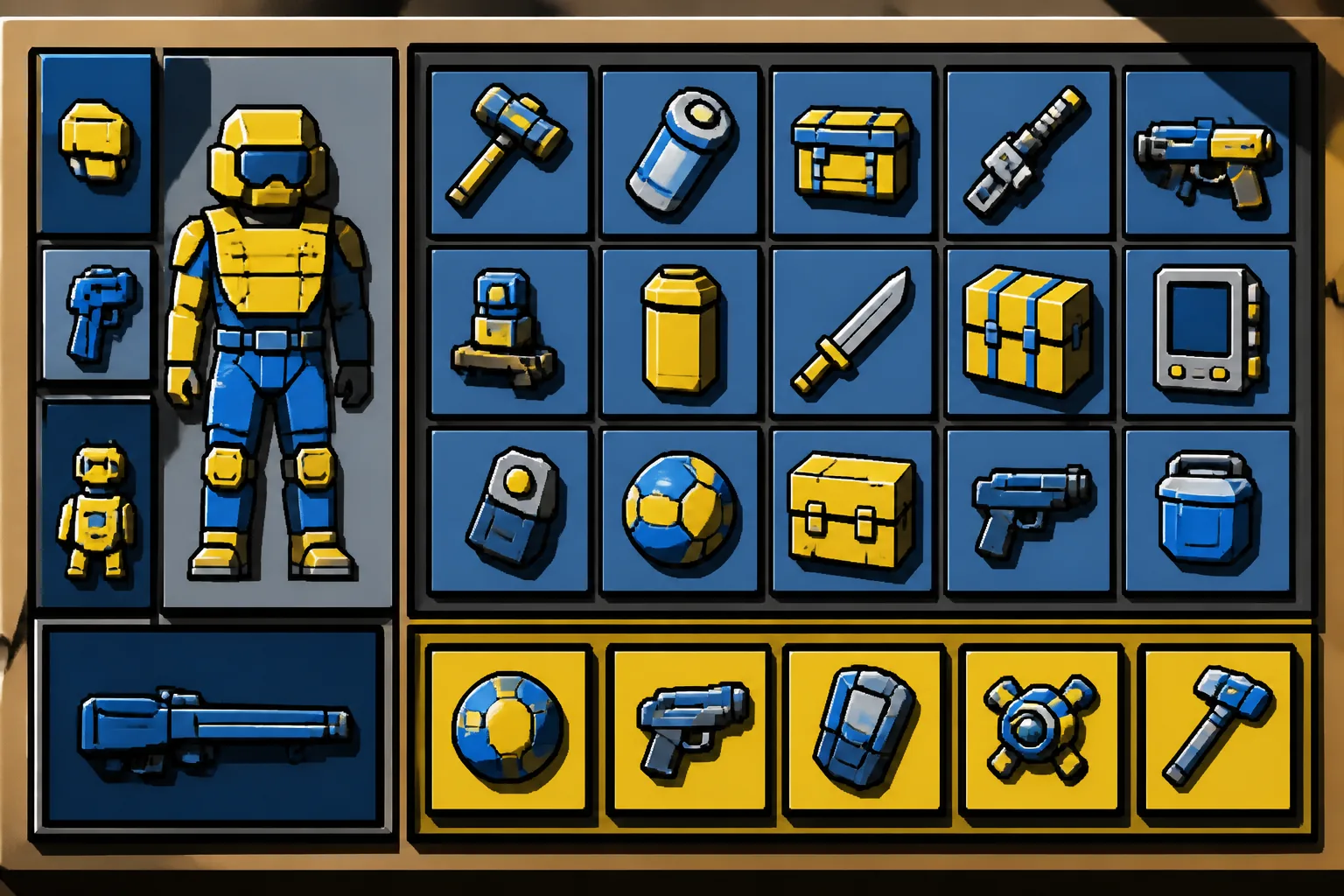
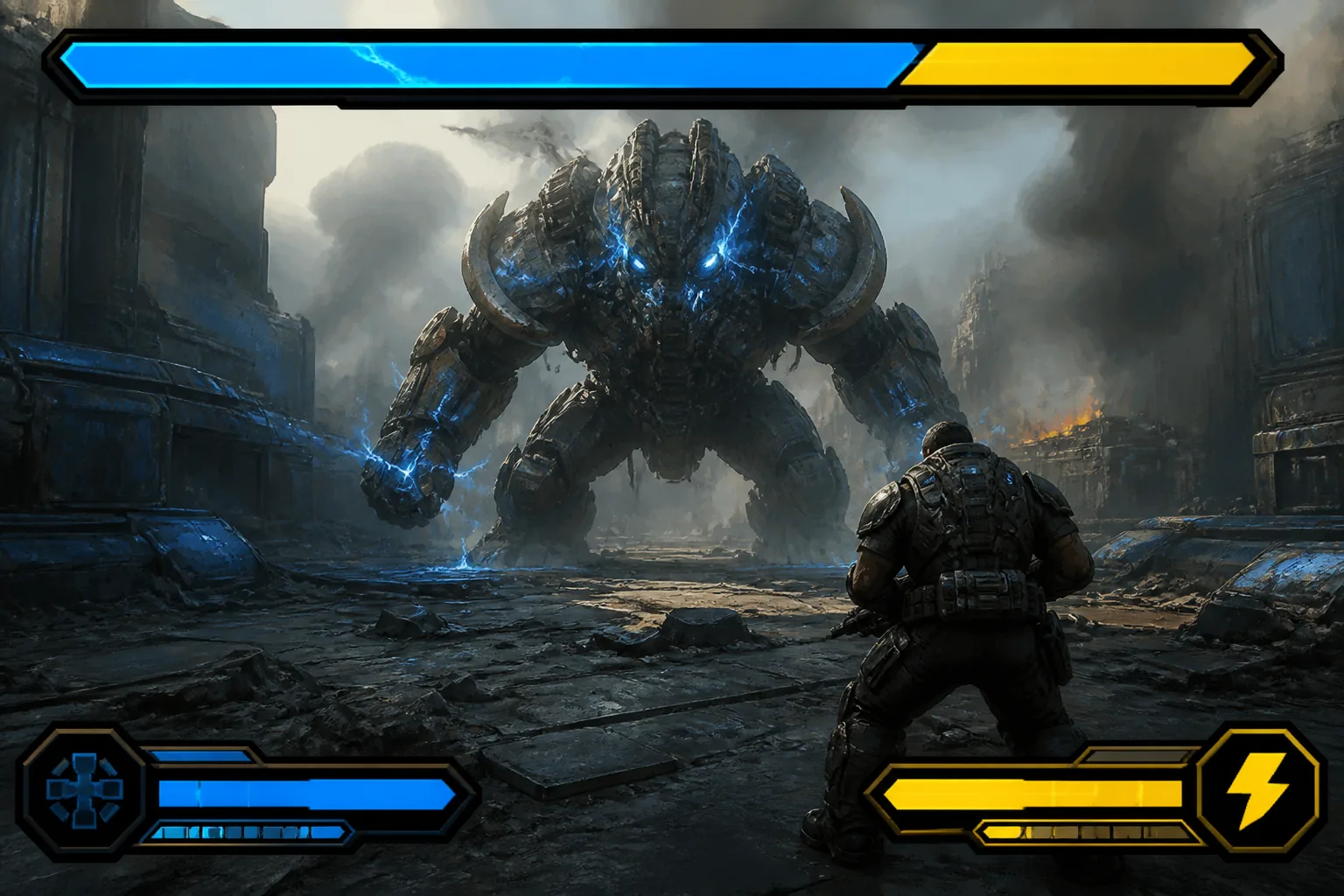
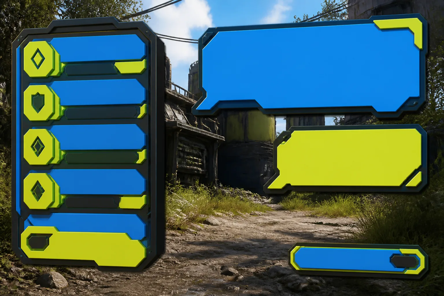
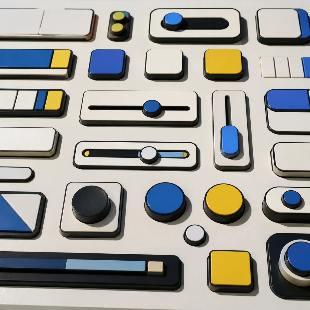
Health and stamina bars, minimaps, quest logs, dialogue boxes, inventory grids, ammo counters, buttons, toggles, sliders, tab strips, tooltips and modal shells. Each in idle, hover, focus and disabled states.
- HUD widgets
- Menu controls
- Inventory & loadout
- Dialog & prompts
120+
Templates
18 full-screen layouts
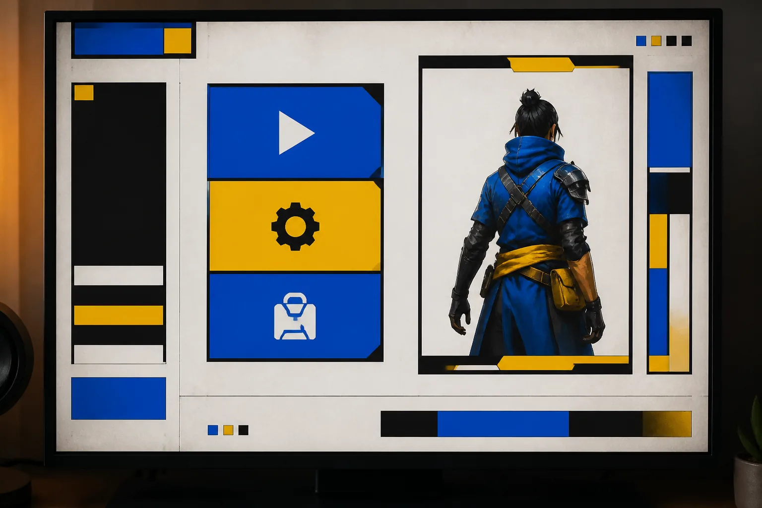
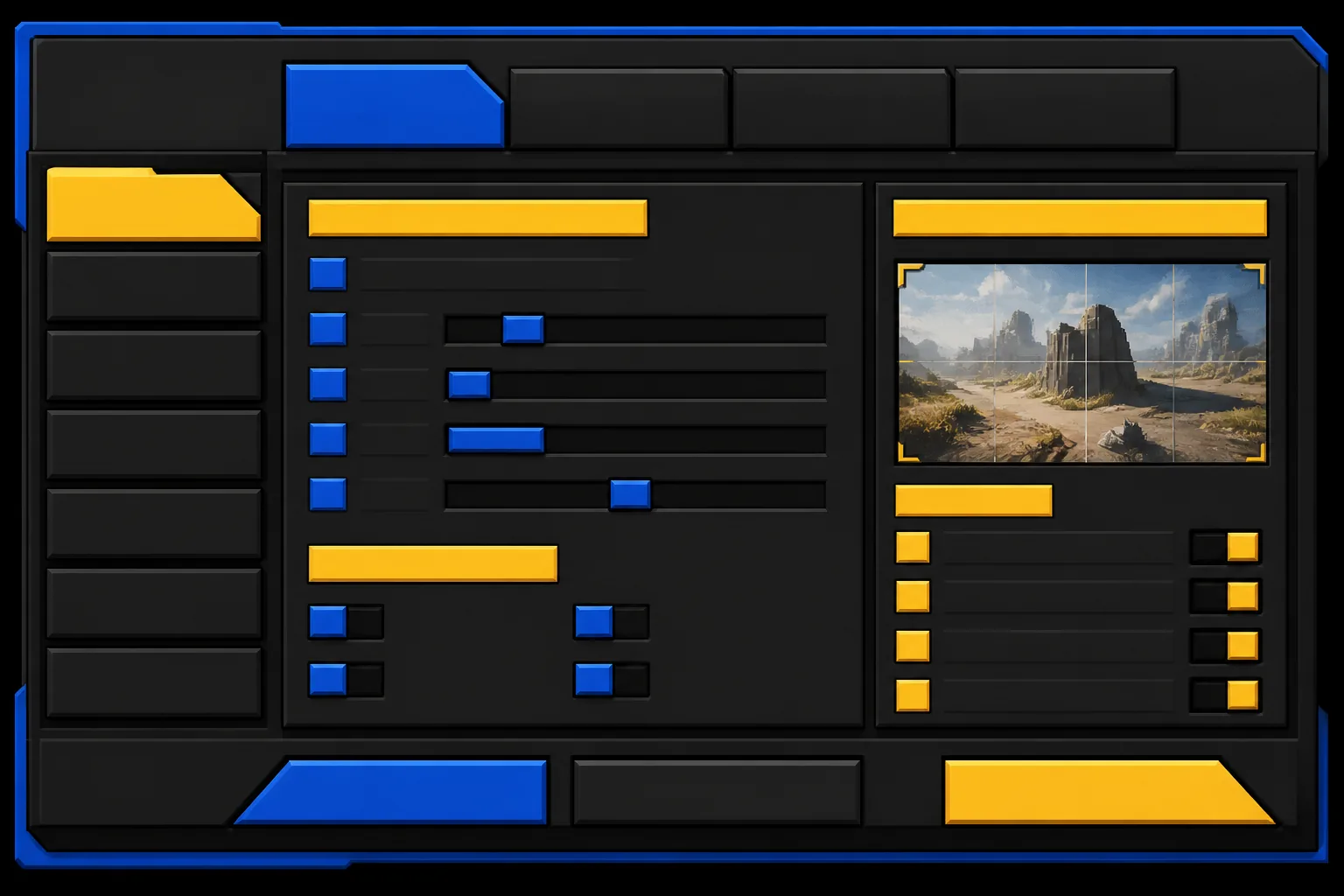
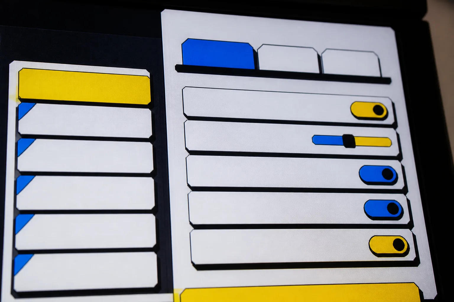
Main menu, pause, settings with tabbed panels, inventory, map, character sheet, shop, save/load, results screen and a five-step onboarding flow — all laid out on the same grid so screens feel like one product, not ten.
 Tokens
40 design tokens
Color, spacing, type scale and radius as named variables. Swap the accent once, the whole kit re-skins.
Guidelines
A 46-page field guide
Why each pattern is shaped the way it is, what to keep, and the traps that make HUDs hard to read.
Formats
Figma + exportable assets
A tidy Figma library with variants and auto-layout, plus SVG and 9-slice PNG exports and a CSS/UXML token sheet you can paste into Unity UI Toolkit or a web build.
- Figma library (variants + auto-layout)
- SVG & 9-slice PNG exports
- CSS / UXML token sheet
Onboarding
First-run flow kit
Coach marks, tooltip sequences, an empty-state set and a five-screen first-session walkthrough — the stuff most teams bolt on last and regret.